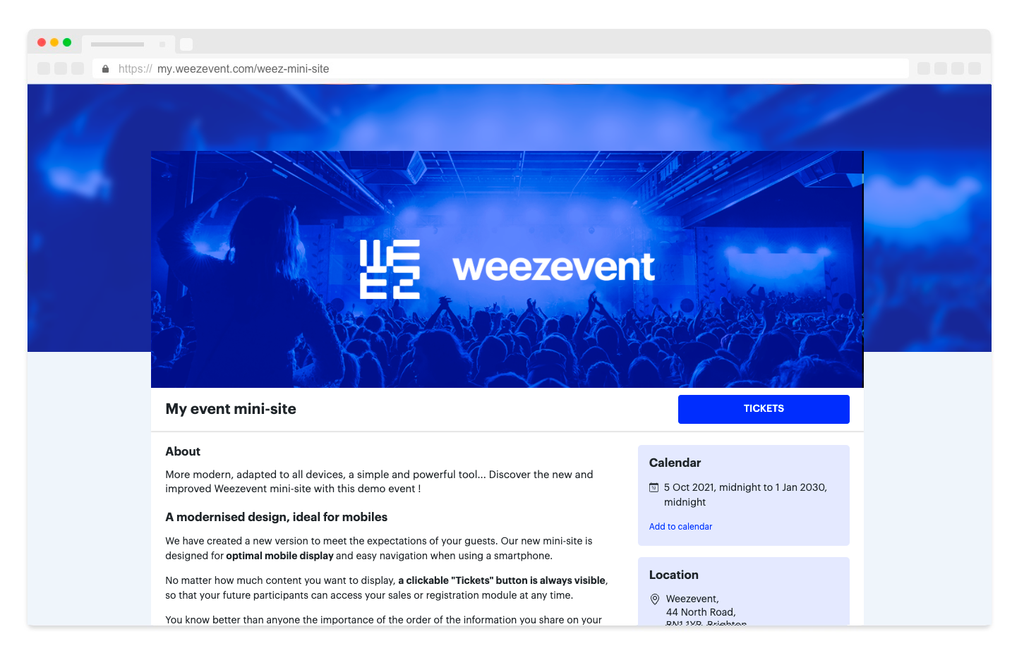
Back in 2008 we were the first to let organisers create a mini-site in the image of their event in just a few clicks enabling them to sell tickets and manage registrations autonomously.
Today, thanks to your feedback, we are particularly proud to unveil an updated and improved version of the mini-site, in order to better respond to the elements that make each of your events unique.
In this article, you will find a detailed review of the changes made to make your mini-sites better, more adapted to all screen sizes and always true to the identity of your events.
Overview
- Access the new version
- A modernised design, conceived for the mobile
- A redesigned creation interface
- A design that looks like you
- Add images of your choice
- Easily organise your content
- Optimised referencing
- Removed elements
- Have a question?
1. Access the new version
From Tuesday 5 October 2021, all new events created will have a mini-site with the update directly integrated. You don’t have to do anything!
For events created before this date, you can activate the new version of the mini-site for the events of your choice, from your organiser interface. Just click on Sell -> On your mini-site -> Try now. This will take you to your new mini-site editor with a brand new look.

Your already published events will not be updated without your action.
2. A modernised design, conceived for the mobile
We have thought of the new design to meet the expectations of your future participants. Offer a new style of mini-site, designed for optimal mobile display and easy to use from a smartphone.
No matter how much content you want to display on your mini-site, a clickable “Ticketing” button is always visible, so that your future participant can access the sales or registration module at any time.
View a demo mini-site by clicking on the button below:
3. A redesigned design interface
The various settings and features are more easily accessible, even from your phone!
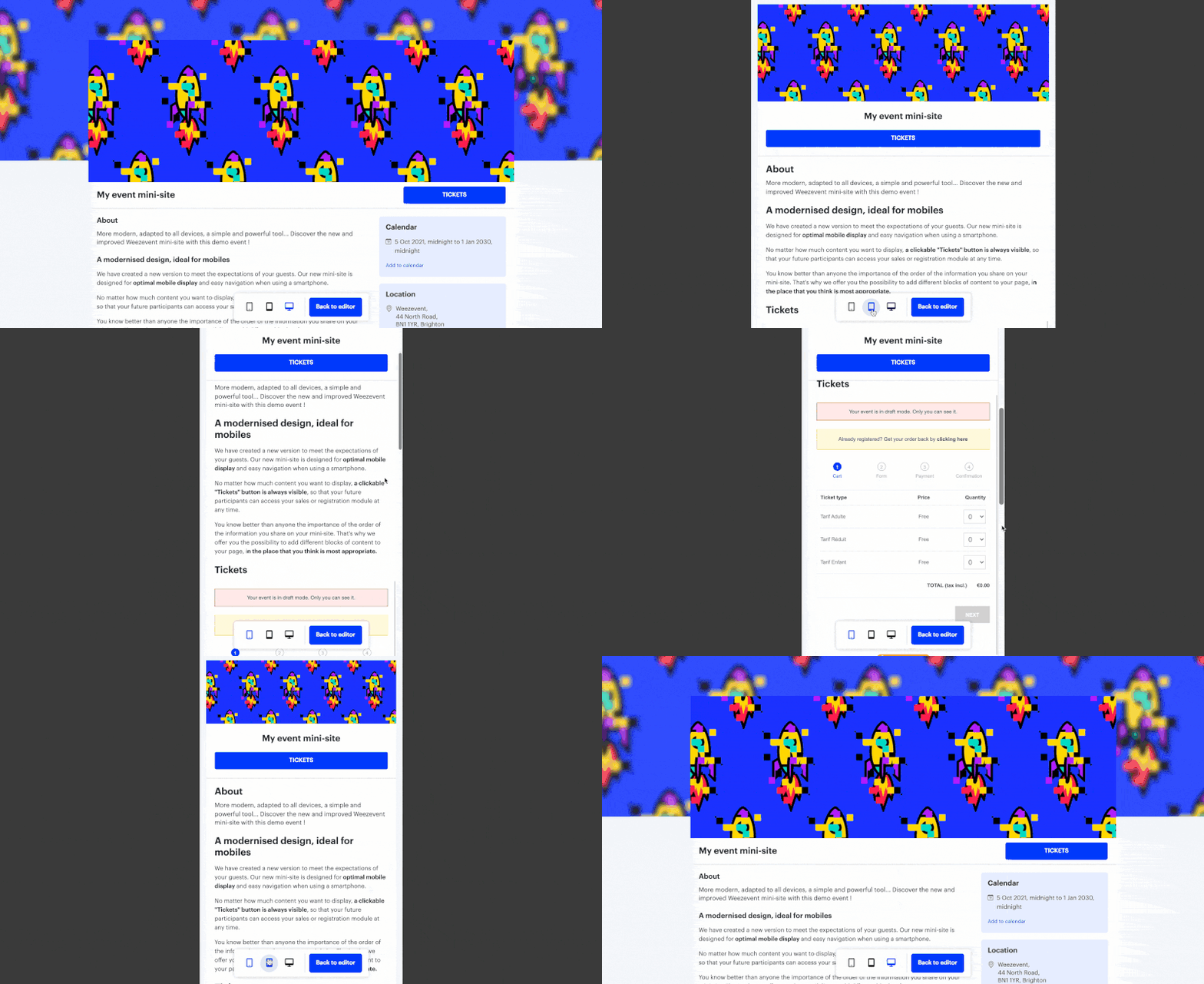
You can now preview your mini-site while editing with a preview on 3 devices: mobile, tablet and desktop.
4. A design that suits you
As in the previous version, you still have the possibility to customise:
- the background colour
- the colour of the buttons
You can also specify the language in which the mini-site will be displayed among 5 different languages: French, English, Italian, Deutsch and Spanish.
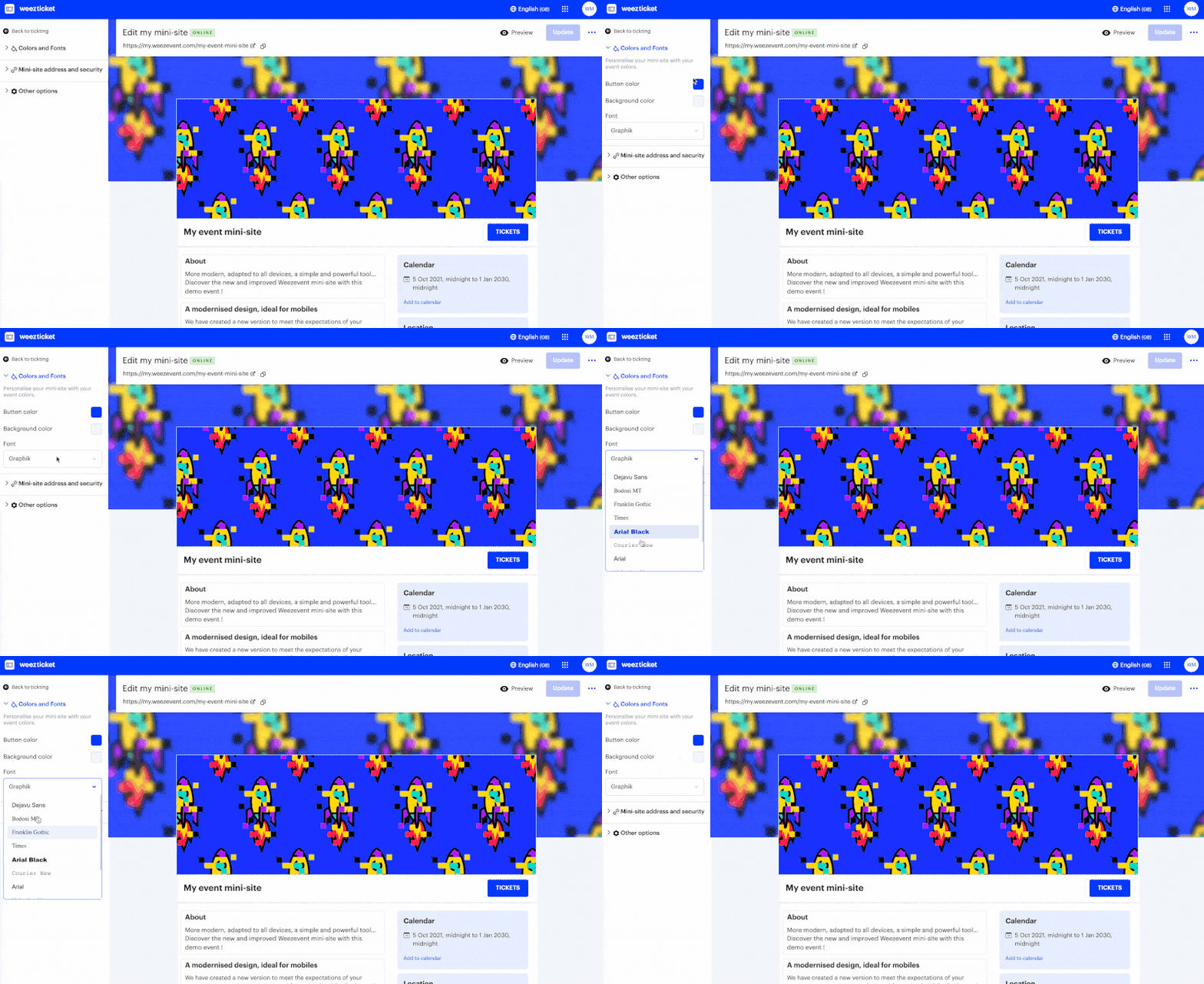
The 2021 version also includes the possibility to choose from 7 different fonts.
5. Add the illustrations of your choice
In order to respect your graphic charter and to better communicate on your event, you can add the banner of your choice:
- your own illustration (graphic creation or photo),
- an illustration available among the proposed models,
- an illustration selected from the new integrated free image bank.
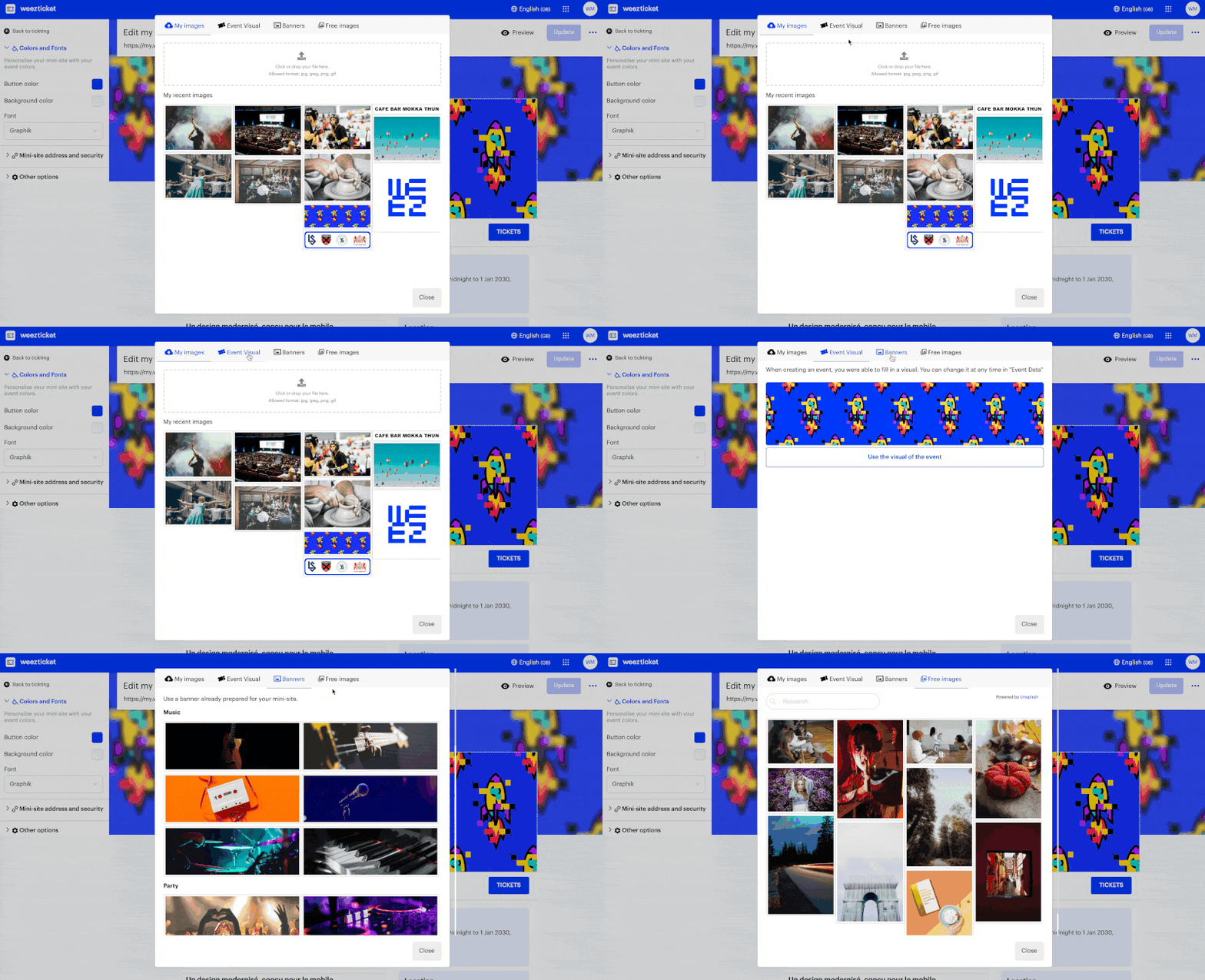
Specify also the visual you wish to see appearing on the social networks, when you – or your participants – share the link of your mini-site.
Finally, customise the favicon of your mini-site, which is the icon illustrating your page on the tabs of Internet browsers.
![]()
6. Simply organise your content
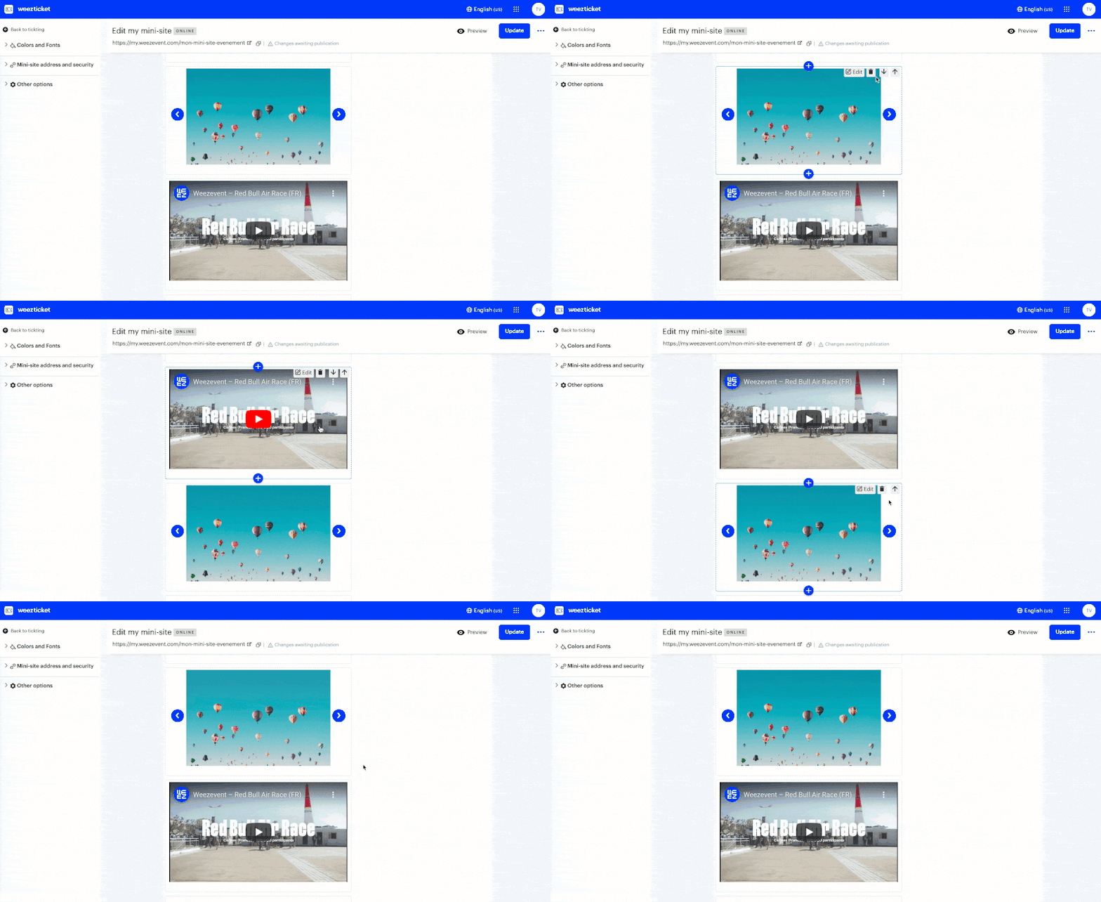
You know better than anyone how important well structured information you share on your mini-site is. That’s why we offer you the possibility to add different blocks of content to your page in the place that you think is most appropriate, allowing you to display:
- customisable text,
- an image or a carousel of images,
- a video,
- items to download.
You will also find practical and additional information blocks: :
- inclusion to the participant’s calendar,
- an interactive map of your event’s location,
- contact information,
- your social networks.
In the new version of the mini-sites, all of these content blocks have been redesigned to make them more understandable to your participants and easier to integrate into your mini-site, where you think it is most appropriate.
We are continuing to work to provide you with the most relevant features possible, and new options will be available in 2022, such as the following content blocks: countdown, Instagram posts, Facebook posts, important message, tickets sold, weather…
7. Optimised Internet referencing
The best practices to be well referenced on search engines evolve regularly. With this new version, we have made sure that your mini-sites continue to respect the fundamentals of the web, to guarantee you the best possible visibility:
- Optimised loading speed in browsers
- Display designed for all screen sizes (100% responsive)
- Possibility to modify the title and description of your event
- Clear source code that can be understood by search engines
8. Removed elements for better accessibility
By analysing your use of the minisites and listening to your feedback, we have removed some features that had become obsolete.
News
You used to be able to use this feature to publish news, in the form of dated posts. While the “News” block has disappeared, you can still give your participants more information by editing the text block as many times as you need.
Google Maps
The feature to add a Google Maps to your event has also been removed. It was a duplicate of the map of the event location, which was already displayed automatically.
9. Do you have a question or need help?
We are always available to answer your questions. Please do not hesitate to contact our customer service on +33 (0)1 86 65 24 00
Discover the new mini-sites now:
Your opinion counts! You can give it to us directly from your mini-site customisation interface.
